Design Tokens as a Developer Tool in Swift
At work, I am always on the lookout for ways to make things easier and more efficient. Our team has weekly meetings to discuss ideas and brainstorm possible solutions.
In my proposals, I tend to think more about the developer experience. In fact, just the other day I stumbled upon a dusty, old proposal I submitted two years ago about design tokens. After all, who said design tools can't be developer tools as well?
What are design tokens anyway?
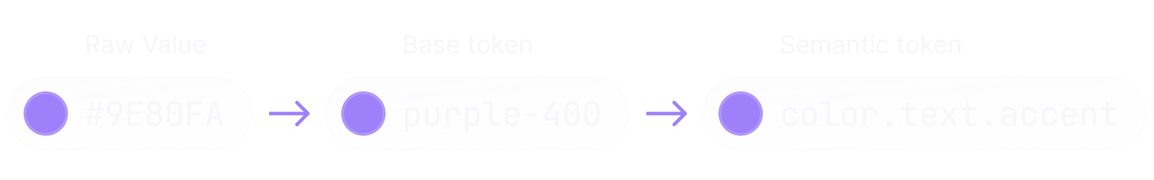
Design tokens are the tiniest pieces of information that, together with components, patterns, and guidelines, make up a design system. Tokens can be color values, font sizes, weights, families, as well as whole typography styles, shadows, and more.
Tokens can also be categorized, so we have base tokens, and semantic tokens that clearly explain their scope, and the context they should be used in.
It's clear how design tokens can help designers better organize the design system. But how do developers manage their design tokens?
The current state of design tokens adoption
For a few years, there was no notion of design tokens, so developers were left to their devices. It was up to them to build systems that would support the designers' needs. Most times, there would be no system at all, with one-off values, and components all over the place.
Then, the Design Tokens Community Group started working to familiarize people with design tokens, and introduce a standard. Since then, people in the community have built tools, and plugins to adopt the standard.
Figma got closer to this concept last year when they introduced variables, while many community plugins already support exporting design tokens from variables, and styles. Amazon is working on their translation tool, but it requires the node JavaScript environment – I wouldn't necessarily want to install node.js, and multiple dependencies to generate some code.
Apple, on the other end, is still lagging, and does not currently provide an easy way for developers to adopt design tokens on their platforms. You can create color sets in an asset catalog, and use tools like SwiftGen to generate source code for them, or you could take advantage of the automated resource generation available since Xcode 15. But populating colors in an asset catalog is still very much a manual, and error-prone process.
Just last year, I found myself working on the rollout of a new typeface, together with a new, and more accessible palette system in our applications. None of the tools available at the time truly met our needs. Despite everything, we successfully shipped the improved design system earlier this year, but I now realize how useful that proposal would have been at the time.
So, with a bit more spare time on my hands over the past few days, I decided to get back to it, and built a tool to automate this process.
Introducing Swift Design Tokens
Swift Design Tokens is a command line tool that automates the process of generating design tokens for Apple platforms from Design Token JSON files that follow the Design Tokens Format specifications.
For the tool to work, we need to provide a configuration manifest describing how the generation process should run:
design-tokens init -i "colors.token.json" -o "Output"Running the init command will generate a configuration manifest with basic configuration. The --input option can also accept a list of tokens.json files:
{
  "input": "colors.tokens.json",
  "output": "Output/",
  "colors": {},
  "dimensions": {}
}
Then, we need to provide a design token file, that we can either author ourselves, or export using a plugin on our design tool of choice:
{
  "background": {
    "base": {
      "$value": "#141414",
      "$type": "color"
    },
    ...
  },
  "text": {
    "primary": {
      "$value": "#F7F5FB",
      "$type": "color"
    },
    ...
  }
}
Now, we are ready to run the tool with the generate command, which requires the --configuration option to specify the path to the configuration manifest:
design-tokens generate -c "design-tokens-configuration.json"The command will result in source code generated for the token types specified in the manifest, in our case colors, and dimension tokens (if available).
To avoid conflicts with system types, and properties, swift-design-tokens also generates a set of custom types, and APIs to facilitate the usage of the design tokens.
For colors, the tool generates a ColorToken type, and extends it with static properties to access the tokens:
struct ColorToken {
  ...
}

extension ColorToken {
  ...
  static let backgroundBase = ColorToken(...)
  static let textPrimary = ColorToken(...)
  ...
}
However, these APIs are not meant to be used directly. We can then access our design tokens on SwiftUI types via the Color(token:) initializer, and the token(_:) static function:
var body: some View {
  Text("Hello World!")
    .foregroundStyle(.token(.textPrimary))
}
A similar set of APIs is available for UIKit as well.
However, colors are only a fraction of what swift-design-tokens can do. It also supports dimension, number, and gradient tokens, as well as generating tokens from multiple files, giving developers, and designers, the flexibility they need when organizing their tokens.
For instance, we could provide the tool a design token file for all our base colors, and another token file for our semantic colors:
{
  "input": [
    "color-base.tokens.json",
    "color-semantic.tokens.json"
  ],
  "output": "Output/",
  "colors": {},
  "dimensions": {}
}
This way, we can take advantage of token aliases by referencing colors in our base tokens from semantic tokens:
{
  "background": {
    "base": {
      "$value": "{black.900}",
      "$type": "color"
    },
    ...
  },
  "text": {
    "default": {
      "$value": "{white}",
      "$type": "color"
    },
    ...
  }
}
Let's work together
Whether you're building a new iOS app, need help shipping reliable software, or enhance your team's developer experience, I can help.
Get in touchSimplifying Design Handoff
Another reason why I love design tokens is how they can enhance the design handoff phase. Previously, when designers needed to update the foundations of a design system, like colors, they had to notify developers, and communicate all the changes.
Although it doesn't happen frequently, it's still a pain to repeatedly ping-pong from design tool to code editor, and update the values in code.
However, design tokens greatly facilitate this process. Developers only need to replace the current token files with new ones shared by designers, and regenerate the source code with swift-design-tokens.
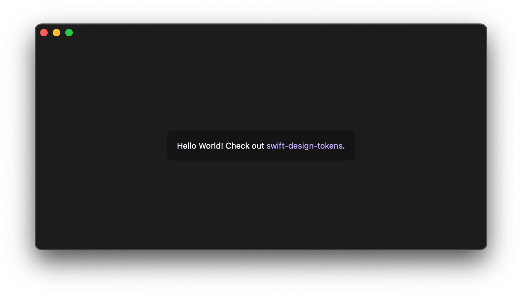
Let's say our application has a set of colors with purple branding. The designers share the token files exported from their design tool. Our semantic tokens look like this:
{
  "text": {
    "link": {
      "$type": "color",
      "$value": "{purple.200}"
    },
    ...
  }
}
The developers run swift-design-tokens to generate source code for the tokens, and use them to build the UI of the app:
var body: some View {
  ...

  Text("Hello World! Check out [swift-design-tokens](https://github.com/gaetanomatonti/swift-design-tokens).")
    .foregroundStyle(.token(.textPrimary))
    .tint(.token(.textLink))

  ...
}
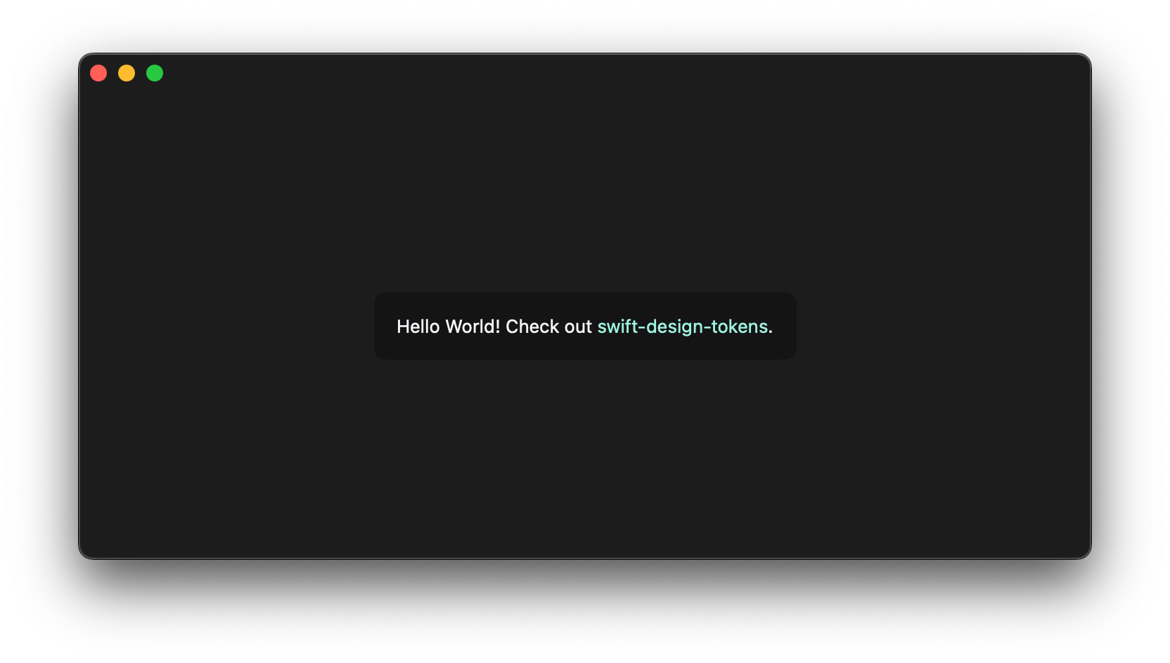
After some testing, the designers changed their mind. They are feeling a bit creative, and want to change the whole branding of the application. They feel like purple is not the right color to convey the purpose of our product, and want to replace it with teal. So they share new token files to update the palette of the application:
{
  "text": {
    "link": {
      "$type": "color",
      "$value": "{teal.300}"
    },
    ...
  }
}
We replace the current token files, generate the tokens again, and run the application. I'm sure the designers will be happy of the result!
With a few commands, we automated the process of updating tokens in our design system. The swift-design-token package contains a demo application, so you can play around with tokens yourself!
The Future of Design Tokens
I believe tools like these are mighty – they facilitate our job, and make it more efficient, with a simple click. I am already planning on adding support for more token types, like typography styles, shadows, borders, and more, and improving the customization of the generated output. I am working on this project in public – you can check it out on the swift-design-tokens repository.
Meanwhile, the Design Tokens Community Group is actively working on improving the Design Tokens Format, and bringing new features. In fact, the format does not currently provide specifications for popular features, like light, and dark mode support. Similarly, it doesn't explicitly support theming, meaning it's up to us to work around it.
I can't wait to see what's in store for design tokens.